SELECTED PROJECTS
Raw Paw - Huey’s Quest: Fruit of the Dragon
Huey’s Quest is a quarterly contest by Raw Paw Ink, a print shop based in Austin, Texas screen printing fun, art-driven, ethically made clothing and goods for artists and businesses.
Over 50 shirts sold and 3rd place overall in the contest!
The Prompt:
“Huey and friends find an unbelievably delicious fruit growing in the clouds. They take a bite and hand the fruit to you to try.
What starts as a roar from inside, grows into a power unlike anything you have felt. You have eaten the fruit of the dragon. With that power, Huey and friends have transformed into dragons."
My adaptation:
5 years later... Huey and the Dragonfruit FKA Pitaya Sayonara are a local band that are gaining steam with every stop on their new tour. Why? Because, have you ever seen a dragon shred a 45 minute guitar solo? This is their official band tee.
Queens MC Homeboy Sandman Rocking The Huey Tee at his inaugural DJ Set
As the Creative Director & Brand Designer of Katalpa, I played a pivotal role in shaping the identity of our clothing company. Katalpa specializes in hand-tied and dyed limited run t-shirts, with each shirt treated as a unique piece of art. I crafted a compelling brand vision, designed the memorable logo, commissioned talented artists, and oversaw production to ensure high-quality standards. Our wearable works of art attracted a diverse customer base, establishing Katalpa as a sought-after and celebrated brand in the street wear industry.
Katalpa - Creative Director / Designer
Sankofa - Sonny Kovah / Album Cover & Packaging Design
For this Sankofa - Sonny Kovah album cover, I was given the directive that it needed to fit the theme of tropical, which guided the overall design and was influenced by the sample choices within the albums production. To capture that essence, I used vibrant, warm colors— lush greens, deep reds, vivid purples, and bright oranges—that immediately evoke a tropical paradise. The color palette was carefully chosen to reflect the laid-back yet vibrant feel of tropical landscapes, while also giving off an inviting, sunny vibe.
Additionally, I wanted the cover to have a retro feel, so I incorporated vintage design elements like hand drawn typography and swirling shapes within the composition that immediately draw you in, reminiscent of the 70’s album cover graphic styles. Think Brazilian jazz. The combination of tropical hues and retro aesthetics aimed to create a nostalgic yet fresh vibe, giving the album cover a timeless yet modern appeal.
18th Ward Brewery - Logo and Label Designs
For the 18th Ward microbrewery, I wanted the branding to reflect both the historical significance of its name—derived from Brooklyn's Ward System—and the playful, engaging nature of the craft beer world. The logo design draws inspiration from late 19th-century typography and iconography, reflecting the era to create a sense of place and heritage. For the labels, I aimed to create illustrations that were fun and approachable, reflecting the brewery’s personality while staying in line with the visual language of its competitors. To make the brand more relatable and memorable, I introduced custom characters on the labels, giving the brewery a more personable and distinctive identity. The overall design blends historical elements with a modern, approachable style, making 18th Ward stand out in the craft beer market while paying homage to Brooklyn’s rich history.
World Animal Protection - Creative Direction, Branding, Booth & Interactive Tank Design / Informational Video (No Tanks Expedia)
As a Creative Director, I led a successful campaign aimed at eliminating sales of tickets to wildlife attractions featuring dolphins. My work with the team at World Animal Protection included developing a compelling message and visual materials that resonated with the public, leveraging social media and other communication channels to reach a wide audience, and ultimately shifting public opinion on the issue.
The campaign's success resulted in Expedia, one of the largest travel booking platforms in the world, banning such sales globally. This achievement highlights my ability to develop and execute effective campaigns that make a positive impact on society.
New York State Parks - Jones Beach Energy & Nature Center - Social Media Graphics
As a Graphic Designer at Jones Beach Energy & Nature Center, I worked within established branding guidelines to refresh and elevate the visual identity across various platforms. I am responsible for designing social media graphics, signage, brochures, and other print materials, ensuring consistency with the center's overall branding while also creating engaging, visually appealing content that resonated with their audience. My role has bridged design and strategy, ensuring that all materials effectively communicated the center's mission and engaged the community.
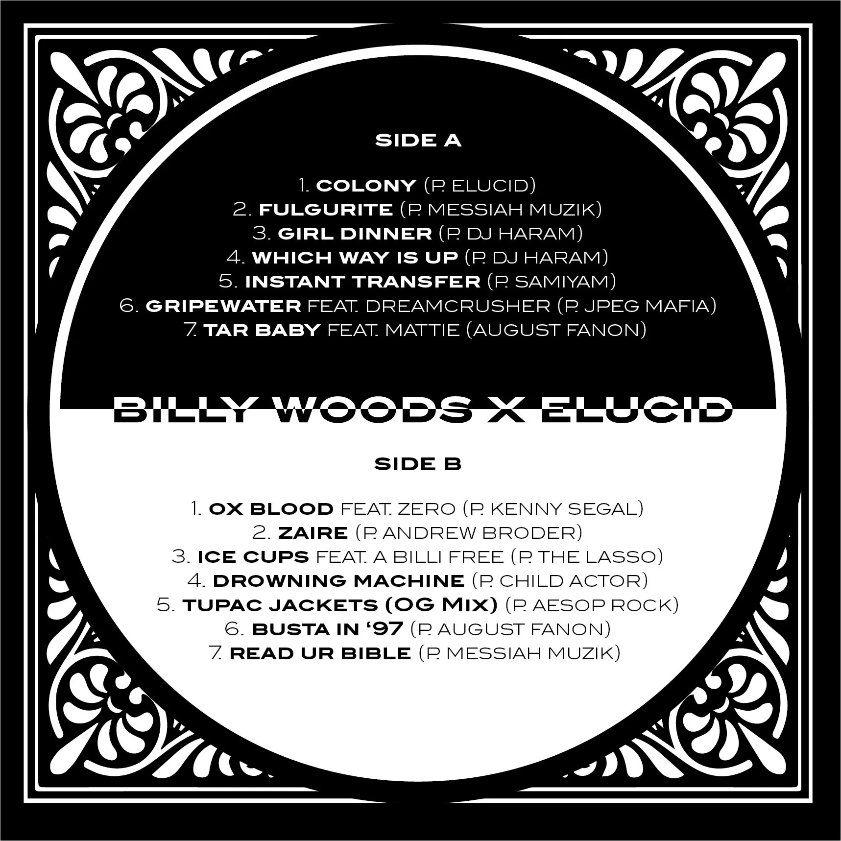
Armand Hammer - BLK LBL / Album Cover, Vinyl Packaging, & Layout - Redesign
This vinyl packaging draws its essence from the spirit of old liquor labels, oozing the vibe of a smoky, underground joint. Stepping in feels like you’re breaking some unspoken rule. It’s the kind of place where the menu’s a secret, and the drinks are as rough as the regulars. It’s foreign yet oddly familiar, like a night you can’t quite remember but know you’ve lived before. The design is a nod to that old memory, looked back with fondness, even though you know it brought the worst headache the next day. It’s like walking into a darkened bar, where the air hums with heavy synths and the past lingers yet pulls you in with every verse, every note, every drone.
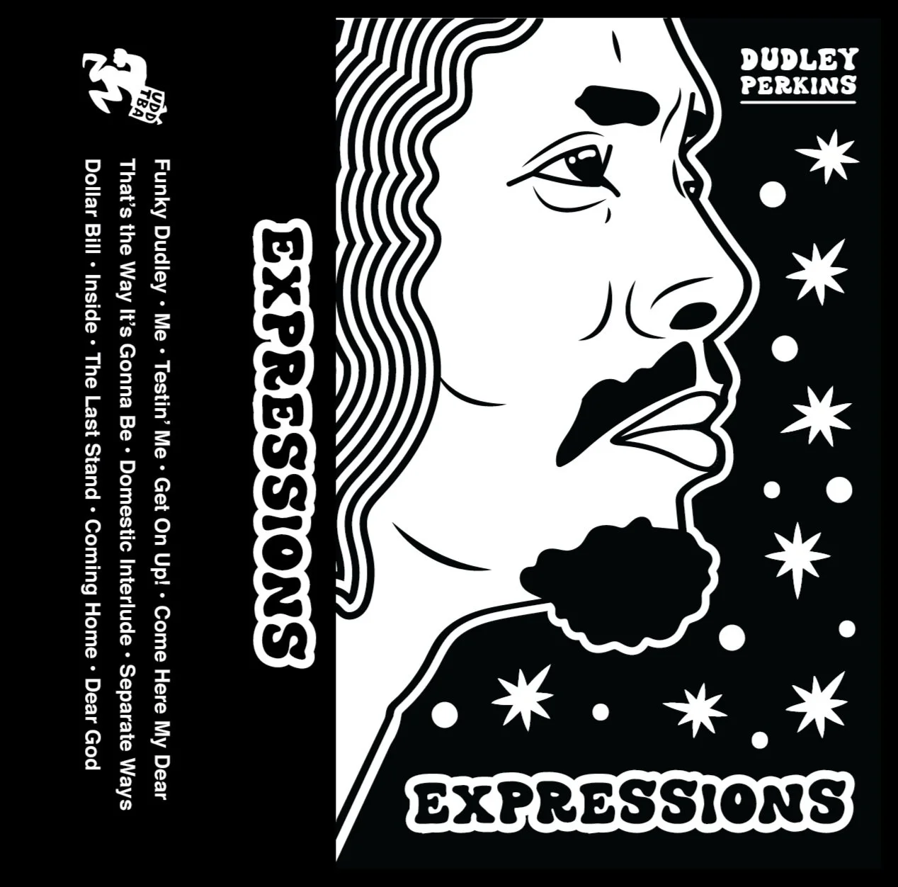
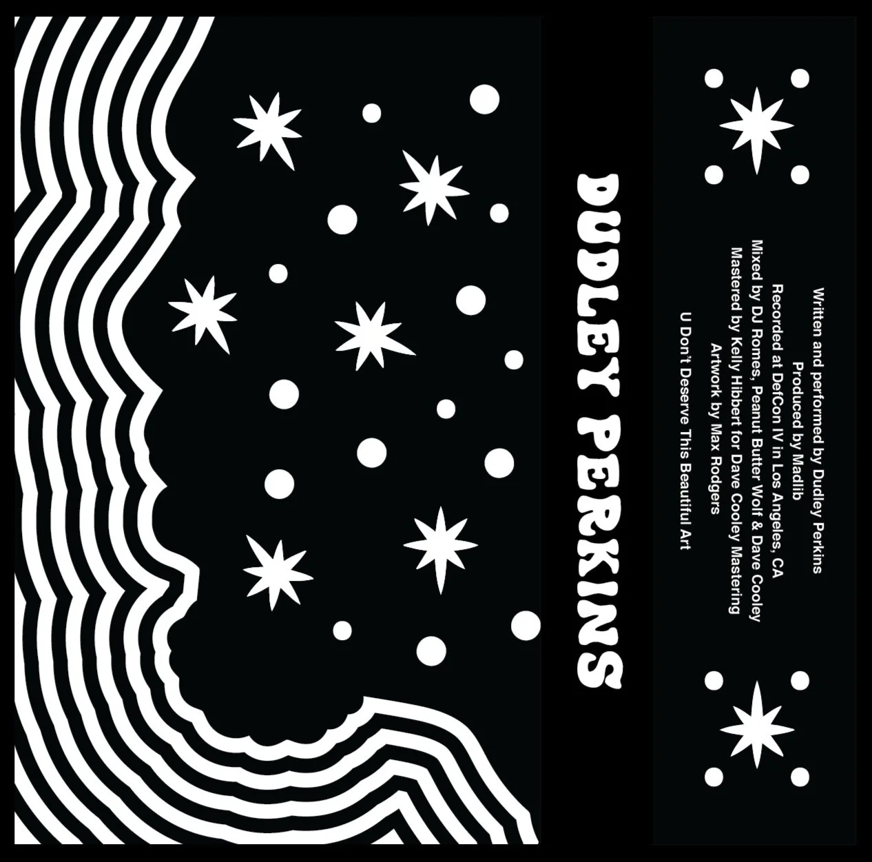
Dudley Perkins - Expressions (2012 A.U.) prod. by Madlib / Album Cover and Packaging
For this project, I was tasked with designing the album cover for the official reissue of ‘Expressions’ by Dudley Perkins (prod. By Madlib) originally released by Stones Throw Records in 2006. Drawing inspiration from 1970s psychedelic and funk album art, I aimed to capture the vibrant, surreal aesthetics of that era in my graphic style. The design features hand-drawn elements, bold typography and excellent use of positive and negative space in black and white.
When working on the re-issue for the 180g vinyl, I focused on remastering the cover to take advantage of the larger format, allowing for more intricate details and a richer visual experience. The goal was to create a design that honored the album's musical legacy while evoking the tactile, collectible feel of vintage vinyl. The end result is a blend of past and present, with a design that connects the album’s sound to the visual language of classic '70s funk and psych records.
UGS MAG - Editorial Illustrations
Gig Posters
Art Morera - Adventure Pack / Merch Capsule (Clothing, Poster & Stickers)
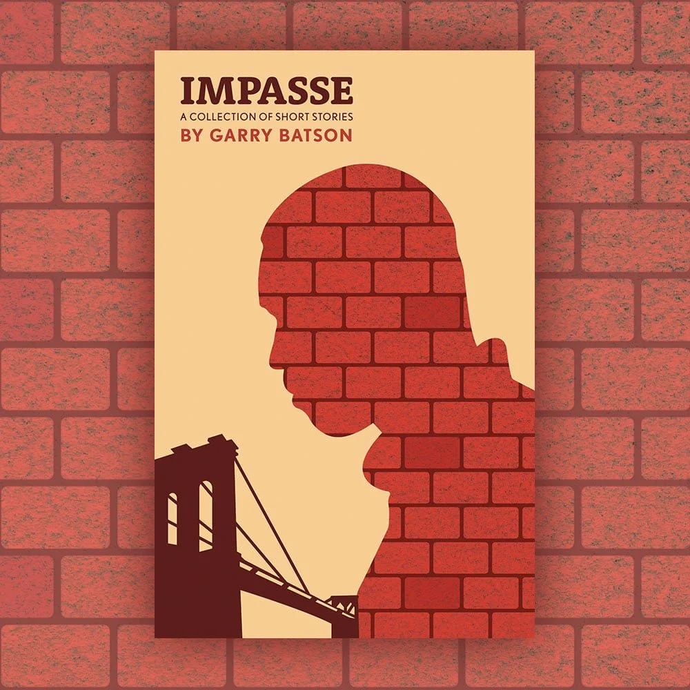
Impasse By Dr. Garry Batson / Book Cover Design
For the cover of Impasse, I wanted to visually represent the emotional distance between the characters and the world around them. The metaphor of a far away bridge felt perfect: something once meant to connect but now incomplete, symbolizing the unbridgeable gap in their relationship with everything around them. To bring this further, making the silhouetted man made out of bricks, created a sense of culpability within the characters struggles. And yet the color palette is warm with intense reds to evoke a sense of passion, possibility and hope throughout those difficulties.
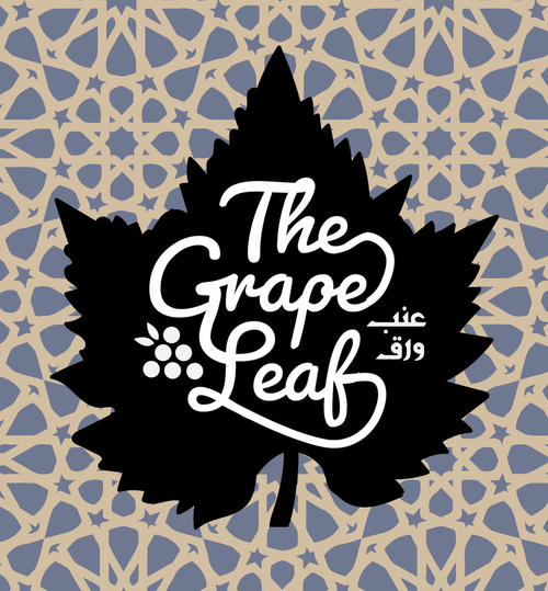
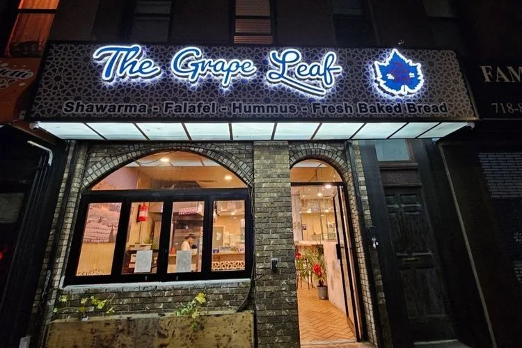
The Grape Leaf - Logo and Storefront Signage (Neon)
For the Mediterranean restaurant's logo and storefront signage, I drew inspiration from traditional Mediterranean design elements, incorporating geometric patterns and flowing lines to evoke a sense of craftsmanship and heritage. Central to the design are grape leaves and clusters, symbolizing the region’s rich winemaking and culinary traditions. The color palette—earthy greens, terracotta, and gold—mirrors the restaurant's interior decor, creating a cohesive, inviting atmosphere. The typography blends modern and traditional styles, ensuring clarity while complementing the organic motifs. The final design aims to be both eye-catching and welcoming, drawing in guests to experience authentic Mediterranean flavors in the heart of Brooklyn.


